The Rule of Thirds
Use It or Lose It!
The Rule of Thirds is a design guide for placing subjects in your picture. Good visual design creates a connection between everything you include within an image.
There should be nothing in your photo that doesn't contribute to the story. This photo composition rule forces you to evaluate whether a thing is really needed to tell your story or whether it's extraneous and needs to be excluded.
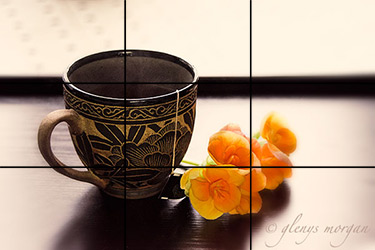
 Demonstrating the Rule of Thirds with a lovely handmade tea cup and pretty begonias. Demonstrating the Rule of Thirds with a lovely handmade tea cup and pretty begonias. |
Here's my tea cup and a few pretty begonias to show you how the rule of thirds works. Check the lines on my image.... 2 lines across - 2 up- down... equally spaced. So, 9 equal sized rectangles. |
Maybe you used to shoot 35 mm film. The proportions in this photo are the same... 2/3. If the height is 4 inches then the width is 6 inches, your typical print size.
If you have enlargements made, 8x12 keeps the 2/3 ratio. An 8x10 or a 5x7 doesn't and you'll lose some of your picture in the crop.
My teacup isn't in the middle, the top of the tray runs along the one-third line. The peach coloured begonias rest on the tray where the bottom right third lines meet.
And that image isn't cropped at all. I set it up... slowly and carefully... in my camera using a tripod. If I cropped it, I'd lose pixels. Depending on the size of the enlargement, there might not be enough information to get a good print.
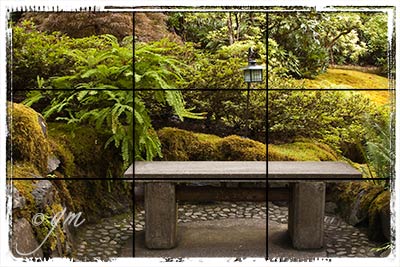
 Stone bench in the Japanese Garden, Butchart Gardens, Victoria, BC. Rule of Thirds grid lines show placement of the bench and stone patio.
Stone bench in the Japanese Garden, Butchart Gardens, Victoria, BC.
Rule of Thirds grid lines show placement of the bench and stone 'patio'.
You can turn on the grid lines in your camera viewer if you want some help setting up your scene. I have the grid turned on all the time . But some people find them too distracting, in which case, turn them off.
A word of warning, the grid in your camera probably isn't divided into thirds... mine has three lines across and down so I have to make the mental adjustments in the process.
But it really helps me get my horizons even as well as set up my composition the way I want it.
 |
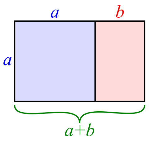
This is the Fibonacci ratio... 1.618. All sides of the square (a) are 1 and the rectangle (b) is .618. Are you interested in Fibonacci and the golden ratio? |
- Some photographers like using the Fibonacci ratio instead of the Rule of Thirds. You'll find information about the golden ratio here.
If you turn this rectangle upright for a vertical shot, you can imagine the sky as either the rectangle (less area) or the square (more area).
Do Your Horizons Need Help?
You'll find out how to turn your grid on by... you guessed it, looking in your camera manual. Look for your viewfinder information.
If you can relate to this....
"How come my horizons are never straight?"
... turning it on might help you out.
But there's something else you should be aware of.
Are you unknowingly pushing the camera down on the right side when you press the shutter? Easy to do unless you relax, concentrate... then push the shutter gently and slowly. This will reduce that sudden downward movement when your finger presses the shutter.
The grid will help line the horizon up but you also have to hold the camera steady. Better yet, use a tripod.
 Moul N'Aga in Tadrart Acacus in southeastern Algeria. Shared from Wikipedia Commons.
Take a look at the image on the left. Moul N'Aga is sitting smack in the middle of the photo. It's a gorgeous desert scene but the photographer knew it could be better.
After a crop using the Rule of Thirds, the horizon is on the lower third line and Moul N'Aga is sitting pretty on the left third line.
Those small fluffy clouds frame the rock formation almost like a halo, don't you think?
Compose your shot with this rule in mind... don't rely on cropping. You lose pixel information when you crop! Get it right from the start.

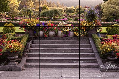
Another shot of Butchart Gardens. There's a hedge along the top third line.... it separates the rose garden from the great lawn.
The bottom third line cuts right across the tops of the stone planters and one stair. The left and right thirds are the downward sloping sides of the stairs and the hedges beside them.
This was only slightly cropped to straighten the stairs. It was just short of perfect since it was on a tripod... using the in-camera grid lines.
Using the Rule of Thirds For Better Photos
... to use or not to use?
There are compositional rules for creating good visual design. Obviously, we don't use every rule in every image.
If the Rule of Thirds helps you position your subjects, you might want to switch on the grid in your camera viewfinder. So, get out your camera manual and find out how to make that grid work for you!
Here's a great YouTube video showing you the principle. The "eyes" have it in this 6 minute tutorial.
Slow down and take your time composing your photos. Most of all, enjoy the process.
Flower Photography Home › Basic Photography › Rule of Thirds


New! Comments
Please leave me a comment in the box below.I'd love to hear your stories, share your photos and read your comments about this page.